Dynamic Sales Dashboard using Microsoft Excel Template:

Description About Template:
Sales dashboards are one of the most popular excel tool for
sales data visualization. Dynamic Sales Dashboard offers a complete autonomous
data visualization of your business. Monitoring and tracking the sales is very
crucial and may impact on your monthly/ quarterly sales targeted. The Dynamic
Sales Dashboard offered by the Excel
Solution provides the dynamic and autonomies visualization of your sales
data.
Features:
First of all, you need to follow the below steps to get the
Dashboard for your Sales Data
·
Paste or enter your data as per the prescribed
format in “Sales Entry” menu
·
If you are pasting the existing data, please
ensure the data shall be pasted under right Table heading and only values without format shall be
pasted to maintain the template format.
·
You can change the Table Heads as per your requirement
·
You can change the Chart Name as per your requirement
Sales Entry:
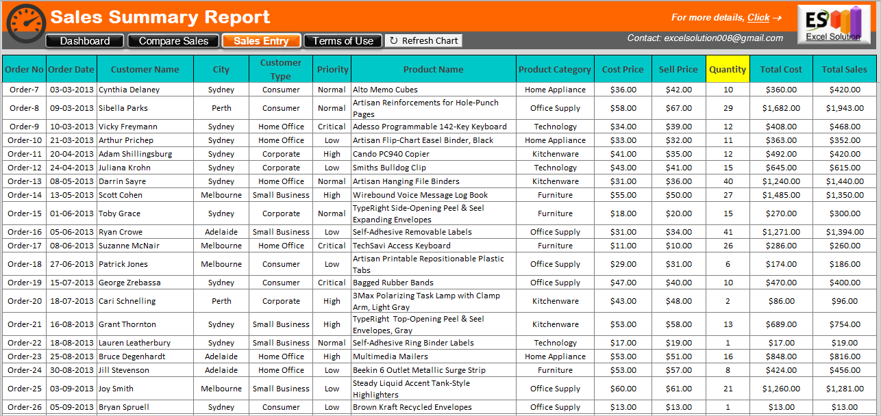
In the Sales Entry menu bar, paste or insert the data as per
the format of the excel template. All the data as per the table is mandatory.
You can modify the table heading as per the requirement. Total Cost is the cost price of all
Quantity. Total Sales is the sales
price of all quantity.
Insert the sales data in “Sales Entry” menu bar in the excel
template. Later than, by clicking on “Refresh
Chart”, all the charts and graphs of the excel template will change
automatically.
Dashboard:

Dashboard is fully dynamic and provides visual presentation
of Sales Data. The Dashboard summaries the various details including, total
sales, profit/ loss, sales distribution based on their emergency, category,
customer type, etc. Certain navigation buttons are also available to get the
Dashboard for a specific timeline.
Menu Bar:
Interactive Menu bar to redirect between multiple pages is
provided at the top of the Tool. There are five (5) buttons Each button
navigates to the respective sheet.
The selected sheet is highlighted with the different colour
(Dashboard is selected in above pic). Refresh
Chart buttons will update the Chart when Sales Entry is modified or
changed.
At the right side corner, the Contact details and website
address can be accessed by clicking on the Excel
Solution button.
Dashboard Navigation:

Navigation Panel used to select a specific range of data
from the available range. By default, all data range is selected. You can
select a single or multiple year or months from available data range.
Total Sales and Profit:

This table provides summary of your total sales value and profit
gained. The Profit is provided in terms of amount as well as in percentage. For
the easiness of tracking, the dynamic color coding is defined. Green color is defined for to indicate
the revenue profit and Red color is
defined to indicate the revenue loss.
Sales Summary:

Column chart indicates the summary of gross sales. You can
select any specific month or year from the Dashboard
Navigation panel and to see the gross sales in that particular month or
year.
Order Priority:

The orders which are fulfilled based on its priority, is
also summarized through a bar chart.
Product Category Trend:

For the quick understanding the product trend based on all
past orders/ sales, the Trend chart is prepared.
Sales Distribution:

Based on the order delivery in the specific region, the Pie
chart is prepared to provide visualization of Sales distribution in all past
sales.
Customer Type:

For the targeted customer in history of sales, the radar
chart is provided.
Compare Sales:

Comparing your products in terms of total sales, profit may
useful to take future business decision. With this comparison chart, you can compare
any two products for its Total Sales, Quantity, Profit, Profit%.
You can select from the drop down menu (right side top corner) to see the comparison
statement. Also from the side navigation, you can select any product see its
performance graph.
This
Comparison graph is also fully dynamic and update with respect to change in the
sales entry.
Charges:
- Per User Charge:
$ 9.99FREE
Payment Method:
 |
 |
 |
Download:

Other Relevant Posts:
- Simple Project Management Dashboard using Microsoft excel.
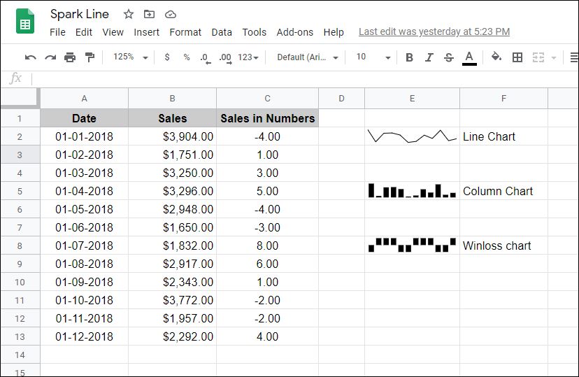
- How to use SPARKLINE function in Google Sheets?
- How to use the IF function in Microsoft excel?
- How to use the DAYS function in Microsoft excel?
- How to use the COUNT function in Microsoft excel?
- How to use the SUM function in Microsoft excel?
- Calculator using VBA in Microsoft Excel.