

How to use SPARKLINE function in Google Sheets?
ABOUT:
This function used to create
miniature charts contained within a single cell in Google Sheets. This function
returns a chart based on the values provided from the reference data set.
Different type of charts like “Line”, “Bar”, “Column”, “Winloss” can be created by using the same function based on the requirement.
PURPOSE OF THE FUNCTION:
To create miniature charts contained within a single cell
OUTPUT VALUE:
A miniature chart
SYNTAX:
=SPARKLINE(data, [options])
=SPARKLINE(data, {“charttype”, “type of chart”})
ARGUMENTS:
data: Required. The range or array containing the data to plot
options: Optional. A range or array of optional setting and
associated values used to customize the chart
The “Charttype” option defines the type of chart to plot in cell, which include:
- "line" for line graphs (this is default)

- “bar” for stacked bar charts
- “column” for a column charts

- “winloss” for a special type of column chart that plots two (2) possible outputs that is positive and negative.

Further this charts also can be
formatted by giving additional setting to the tool.
For “line” charts:
- "xmin" sets the minimum value along the horizontal axis.
- "xmax" sets the maximum value along the horizontal axis.
- "ymin" sets the minimum value along the vertical axis.
- "ymax" sets the maximum value along the vertical axis.
- "color" sets the color of the line.
- "empty" sets how to treat empty cells. Possible corresponding values include: "zero" or "ignore".
- "nan" sets how to treat cells with non-numeric data. Options are: "convert" and "ignore".
- "rtl" determines whether or not the chart is rendered right to left. Options are true or false.
- "linewidth" determines how thick the line will be in the chart. A higher number means a thicker line.
For “Column” and “Winloss” charts:
- "color" sets the color of chart columns.
- "lowcolor" sets the color for the lowest value in the chart
- "highcolor" sets the color for the higest value in the chart
- "firstcolor" sets the color of the first column
- "lastcolor" sets the color of the last column
- "negcolor" sets the color of all negative columns
- "empty" sets how to treat empty cells. Possible corresponding values include: "zero" or "ignore".
- "nan" sets how to treat cells with non-numeric data. Options are: "convert" and "ignore".
- "axis" decides if an axis needs to be drawn (true/false)
- "axiscolor" sets the color of the axis (if applicable)
- "ymin" sets the custom minimum data value that should be used for scaling the height of columns (not applicable for win/loss)
- "ymax" sets the custom maximum data value that should be used for scaling the height of columns (not applicable for win/loss)
- "rtl" determines whether or not the chart is rendered right to left. Options are true or false.
For “Bar” charts:
Bar type chart is used when two different values are available to plot into chart.
- "max" sets the maximum value along the horizontal axis.
- "color1" sets the first color used for bars in the chart.
- "color2" sets the second color used for bars in the chart.
- "empty" sets how to treat empty cells. Possible corresponding values include: "zero" or "ignore".
- "nan" sets how to treat cells with non-numeric data. Options are: "convert" and "ignore".
- "rtl" determines whether or not the chart is rendered right to left. Options are true or false.
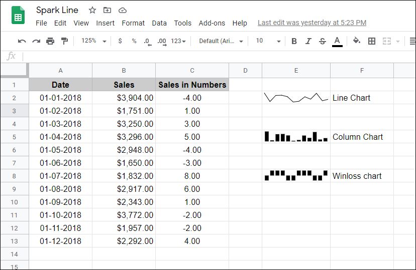
EXAMPLE 1:
=SPARKLINE(B2:B13)

By default the Line chart is selected by syntax “SPARKLINE”. Hence, the above formula will take the data from the given range B2:B13 and returns a line type chart.
EXAMPLE 2:
=SPARKLINE(B2:B13,{"charttype","column"})

In this function we have specified the type of chart in arguments. We required column chart for the data set reference in B2:B13. Accordingly, the column chart will be generated.
EXAMPLE 3:
=SPARKLINE(C2:C13,{"charttype","winloss"})

In this function we required winloss type chart for the data set referenced in B2:B13. Accordingly, we have selected “winloss” chart type in arguments.
OTHER RELEVANT POSTs:
- Simple Project Management Dashboard using Microsoft excel
- How to use the IF function in Microsoft excel?
- How to use the DAYS function in Microsoft excel?
- How to use the COUNT function in Microsoft excel?
- How to use the SUM function in Microsoft excel?
- Calculator using VBA in Microsoft Excel


0 comments:
Please do not enter any spam link in the comment box